Ex-Apple Engineer Invents new UI that’s Shaded by Lights in your Room
01/03/2019
1668

The overall UI of iOS hasn’t changed too much since iOS 7 got rid of skeuomorphism, but an ex-Apple employee has come up with a brilliant UI concept that makes elements on your iPhone look like real-life objects.
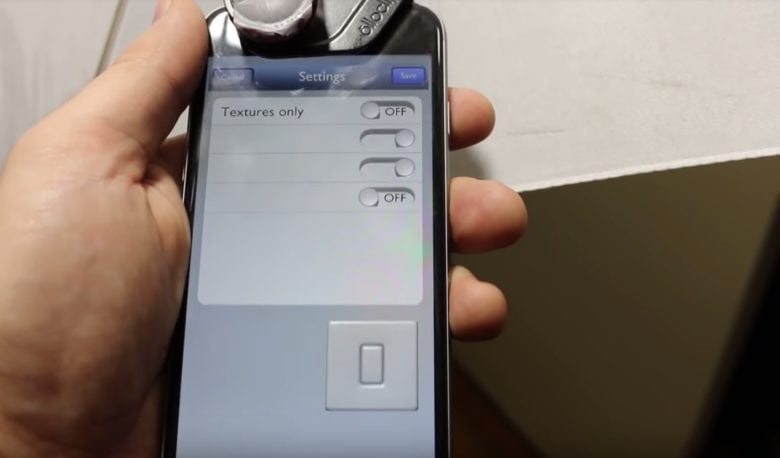
Former Apple software engineer Bob Burrough posted a video of an environmentally-lit user interface he’s developing and even though it’s still very basic, it looks very promising. By using the iPhone’s front-facing camera, the iPhone’s UI shades objects based on the lighting in a room. It may not sound that exciting, but once you see it in action you’ll be wowed.
Check it out:
It seems like it wouldn’t take too much work for Apple to implement this idea into iOS 13. The company would probably need a wider angle selfie camera but that’s it.
Adding environmentally-lit UI elements wouldn’t necessarily make iOS better or faster, but it would make the experience of using an iPhone even more immersive.
Source: cult of mac


