This Is the New Volume Indicator in iOS 13
06/05/2019
1975

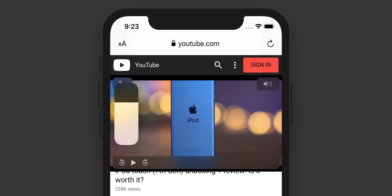
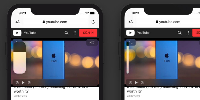
iOS 13 finally includes a redesigned volume HUD. The new volume slider sits on the left side of the screen where the volume up and down buttons are. It first shows as a big bulbous slider, but then shrinks down to a more discreet thin line.
The volume HUD had become the butt of many jokes in the iOS community as the old UI was a large square overlay that covered the center of the display. The new look is smaller and shrinks down to an even smaller presentation after a beat.

The new UI is interactable. In addition to the volume buttons, once the volume HUD is visible, you can drag it up and down with your finger — reminiscent of the slider in Control Center.
When the phone is in landscape, the volume slider appears in the middle of the top of the screen.
Source: 9to5mac


