New Apple Store Changes Gives a New Shopping Experience
06/19/2019
1992
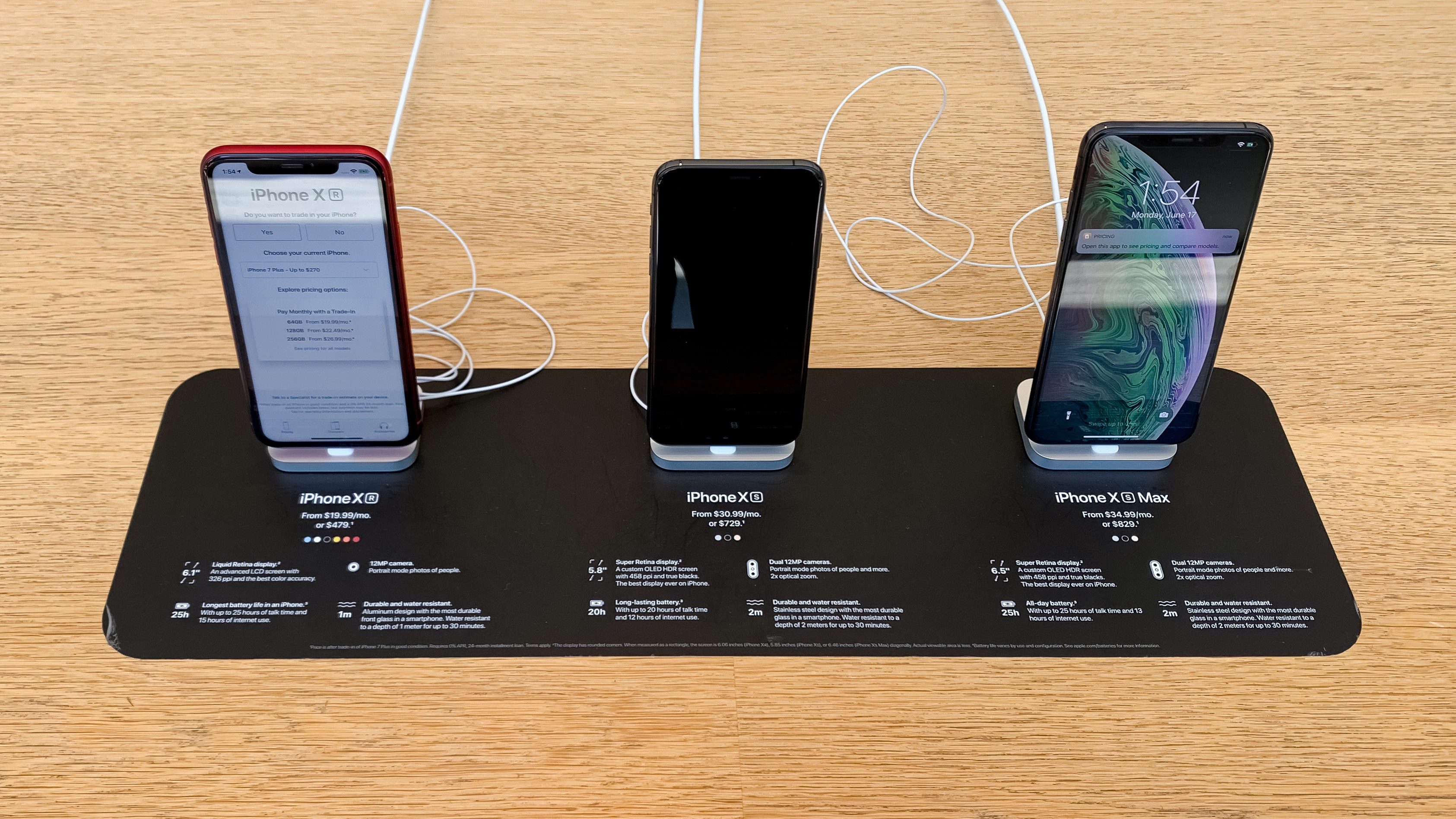
Apple is evolving its in-store shopping experience with signage and display fixtures that remove ambiguity and encourage increased hands-on interaction with products. New designs that have been spotted in multiple locations reflect the changing requirements of busy stores and appear to address common customer needs.
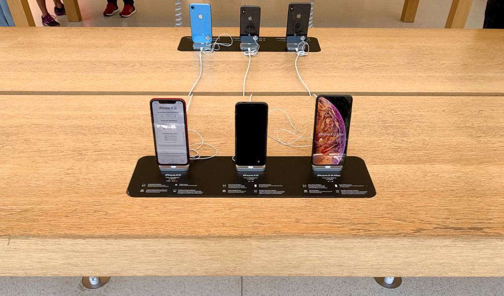
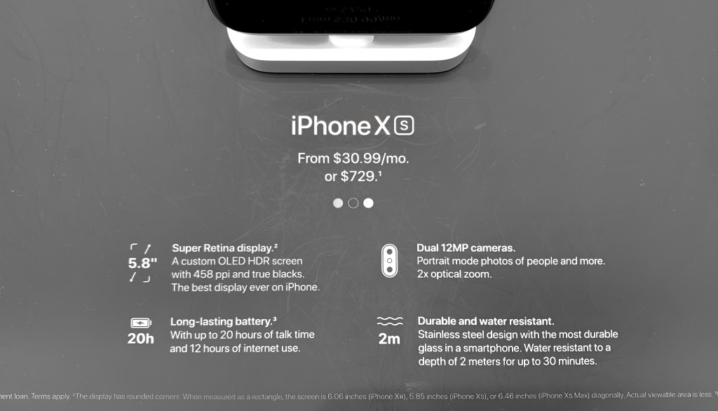
iPhone display tables in Apple Stores are traditionally arranged with rows of devices grouped by model. Specifications for each device like capacity, color, and upgrade options are presented through a Pricing app on each phone. Now, new signs placed on the face of each table group the iPhone XS, XS Max, and XR, offering a quick list of specifications and pricing to compare.
Pictured at San Francisco’s Union Square store, these signs keep basic information accessible at all times while trying a device and should reduce the workload of staff fielding questions from customers who are trying to understand the differences between each model. These signs do not appear to have rolled out to all stores at this time and are limited to the iPhone tables at Apple Union Square.
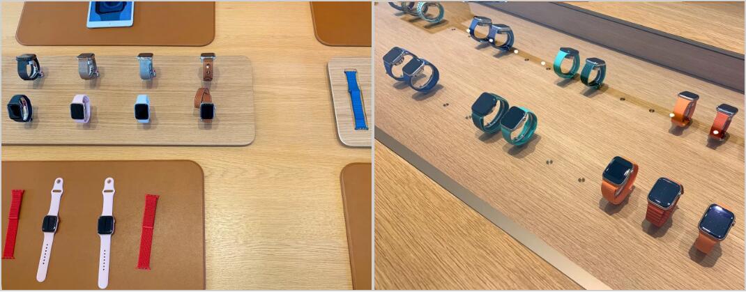
New Apple Watch merchandising has also been spotted. Tables have been redesigned to streamline the process of exploring and trying on watch bands. Most Apple Stores currently offer two watch display tables. The first features a sunken display cabinet with LED lighting and rows of watches inaccessible to customers under a glass panel. The second table features leather mats for trying on watch bands, floating inventory of popular or new band styles, and a raised collection stand with various watch models. Last fall, some locations replaced their original plastic displays with smaller wooden stands that also accommodate two trays for watch bands.
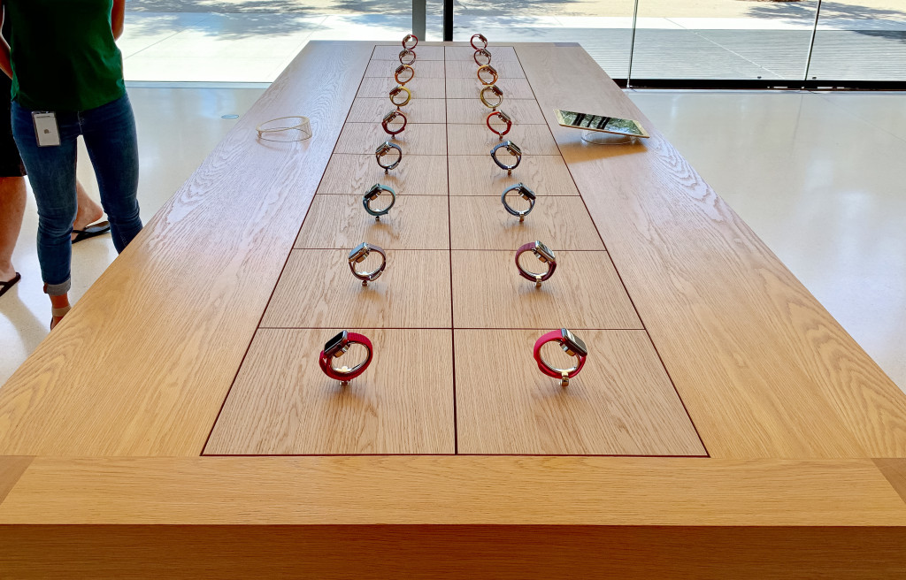
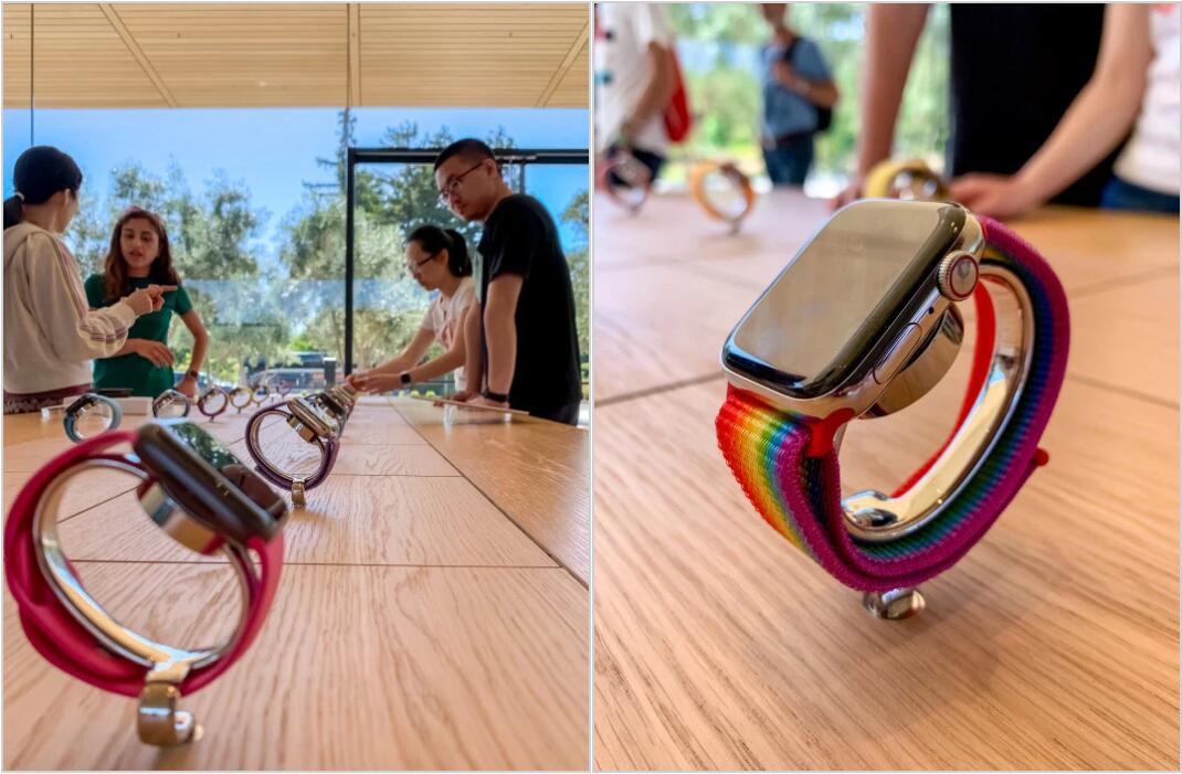
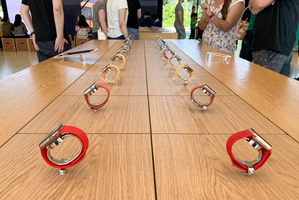
At Apple Park Visitor Center, the glass-topped cabinet has been replaced with two rows of nine Apple Watches on pedestals within reach of customers. Readers report that they were able to freely remove these watches from their stands to try on. Previous displays were glued down and intended for observation only, frustrating customers that frequently tried to remove them.
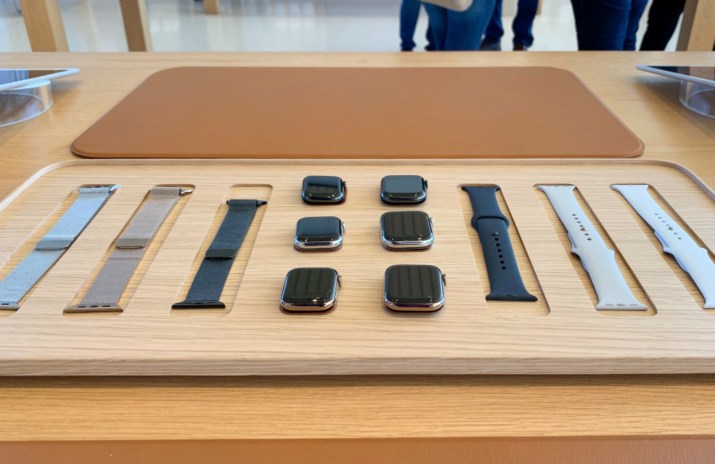
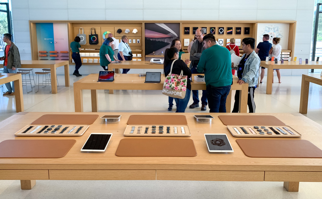
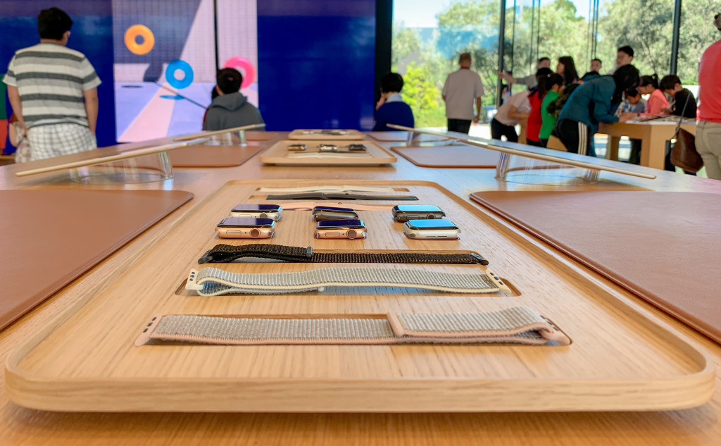
The collection stand has been replaced with new band trays that also house watch cases separated from their straps. This change removes the friction of swapping bands and should dramatically speed up the try on experience. These designs haven’t rolled out to every store, but have been spotted by customers at Apple Michigan Avenue as well. There’s no indication if all locations will receive the same displays.
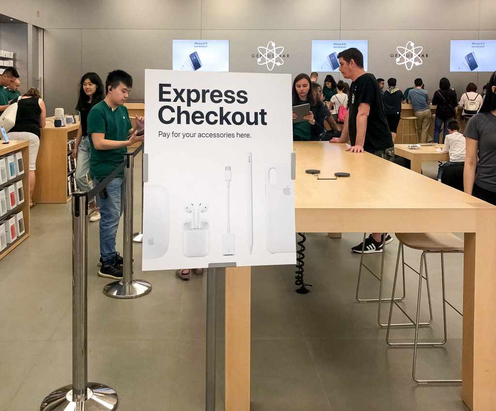
Finally, new easels popping up at some stores across the U.S. and Canada clearly denote an Express Checkout zone to pay for accessories like iPhone cases, cables, and headphones. The signage provides an anchor for customers who are unsure of where to checkout or not aware of the scan and buy self-checkout feature of the Apple Store app.
The new retail design language Apple began rolling out in 2015 brought visual simplicity by deemphasizing signage, logos, and extraneous store fixtures. While more aesthetically pleasing, some customers have found contemporary stores challenging to navigate. These new fixtures and signs show that Apple is willing to fine-tune the balance between appearance and function.
Source: 9to5mac
