Concept Imagines how macOS Could be More Similar to iPadOS
11/22/2019
2171
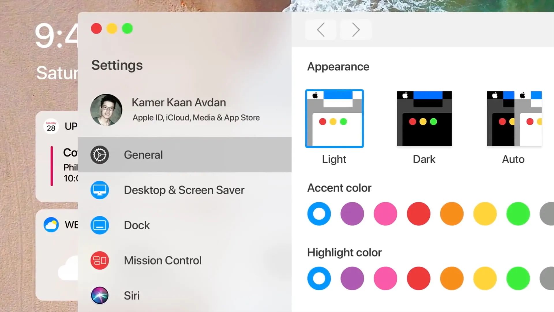
WWDC and the next versions of Apple’s operating systems are still far away, but there are already some people making bets on how the new iOS and macOS should look in the future. This particular concept created by designer Kamer Avdan imagines what a redesigned “macOS 11” would look like if it was more similar to iPadOS in some respects.

In the concept, the icons and other elements of the system were redesigned to be flatter, just like on iOS devices. The first thing we see is a new drag-and-drop method, inspired by the gestures on the iPad. By dragging and holding a document, you could quickly drop it into one of the apps open in the background.
Users would be able to add some widgets to the Mac desktop, such as calendar events and the weather, just as on the iPad home screen with iPadOS. It also shows a new System Preferences that is most similar to the iPad Settings app, with the menus on the left side of the window.
There are some other details like a true-black Dark Mode, redesigned Mission Control, Face ID interface for new Macs, better pairing process for AirPods, a new gesture to share files instantly in AirDrop, and Siri suggestions on Spotlight.
Although there’s nothing to indicate that Apple plans to change the look of macOS by 2020, it’s always good to see some new ideas.
Source: 9to5mac


