Microsoft Redesigns OneDrive for iOS
07/18/2019
1673
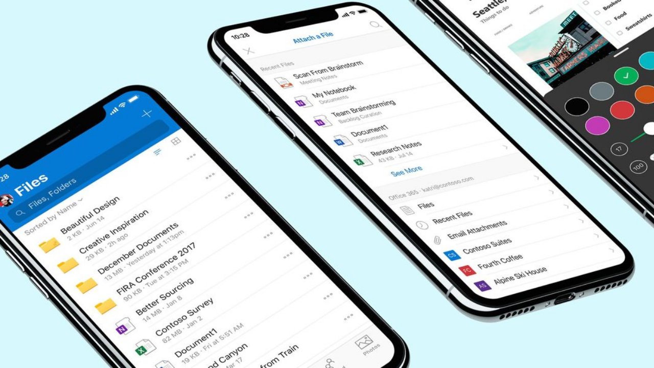
Microsoft is launching some major upgrades to the OneDrive apps for mobile devices. More specifically, the company is introducing a redesigned OneDrive for iOS app to introduce a more consistent experience. The new design for OneDrive on iOS introduces a new look that’s consistent with the entire Office 365 suite, across all platforms.
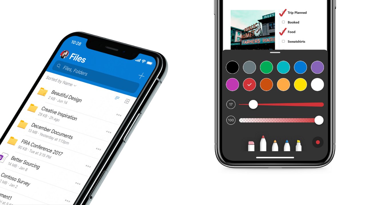
The new-look features a bold header at the top of the app, much like Outlook for iOS. The new experience also improves ease-of-use and minor changes to elements like the font sizes and colors have been tweaked to increase legibility and contrast. The command sheet (i.e. the options menu for files and folders) also has an improved look that’s “softer” and just cleaner overall.
The updated interface introduces an improved experience for PDF annotating as well, now with a new look that makes it much easier to use pens, highlighters, signing, and placing notes. These changes will be making their way to Android soon, by the way. The recent files section has also been updated to now include recently viewed PDFs and scans, much like OneDrive for Web. This change is available both on Android and iOS.
And last but not least, the usability for the settings section has apparently been improved with the new design. The update makes settings more discoverable and accessible. Notification settings are now split up into different, standalone pages for each of your different accounts, and settings for the Camera Upload feature has been updated to give users more control over how the feature actually works.
Microsoft should be rolling out the new look and experience for OneDrive in the coming days, so keep an eye out for the latest updates on the App Store.
Source: thurrott
